Mastering Color Accuracy From Screen to Print
T.K. Broecker / 23 November 2025
Mastering Color Consistency from Capture to Print
Color that matches from screen to print doesn’t happen by accident. With a simple, repeatable workflow—calibrating your monitor, soft proofing, and using the right ICC profiles—you can trust that your final prints will look the way you intended, even with tricky winter portraits and cool lighting.
Start with Solid Color Management
Every device in your workflow (camera, monitor, printer) “sees” color differently. Color management makes them speak the same language so your edits translate faithfully to paper. For a clear overview of standards and best practices, see the International Color Consortium (ICC).
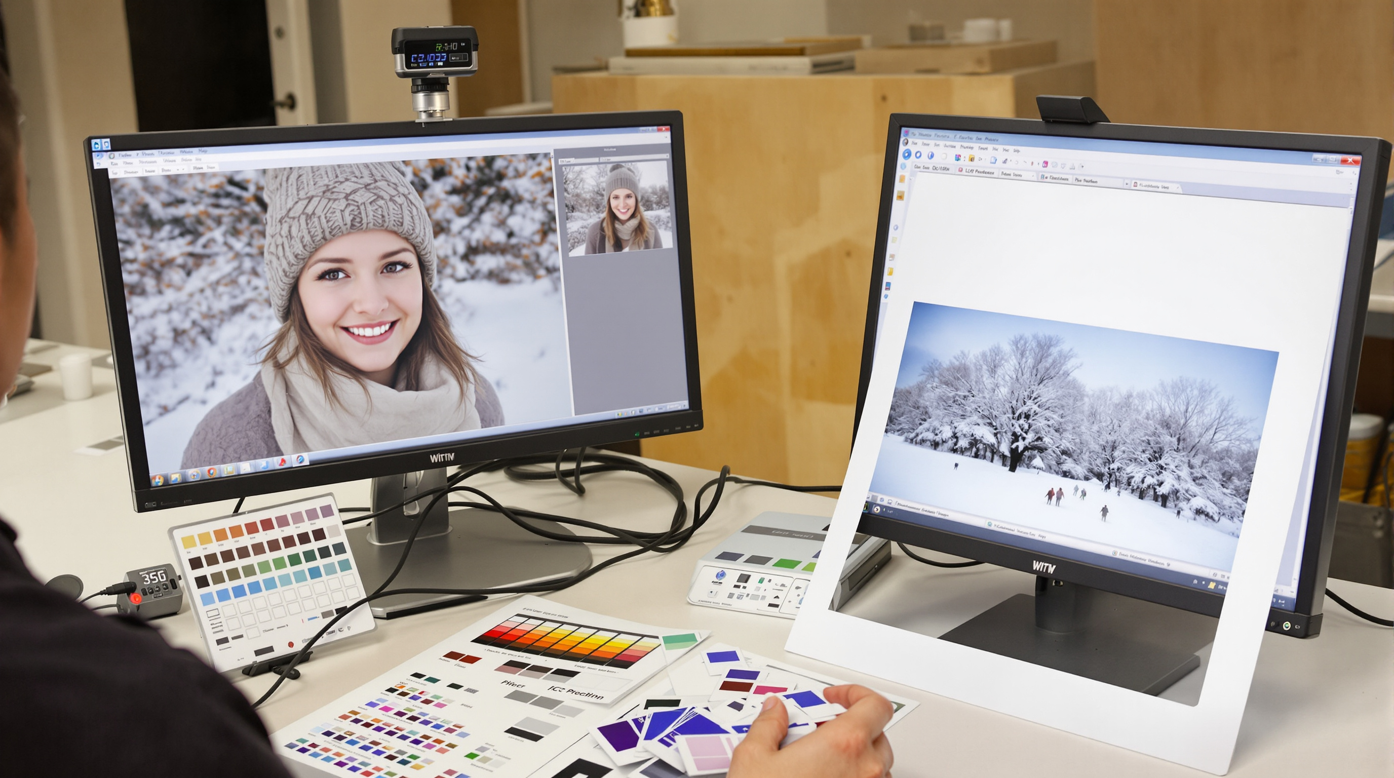
Monitor Calibration (Your First Must-Do)
Use a hardware calibrator (colorimeter or spectrophotometer) to create a custom profile for your display. Recalibrate monthly to prevent drift. Typical targets:
- White point: D65 (≈6500K) or D50 (≈5000K) to match your viewing light
- Luminance: 80–120 cd/m² for print-focused editing
- Gamma: 2.2 for balanced contrast
A calibrated display becomes your reliable reference, so the tones you approve on screen are the tones you’ll see in print.
Taming Winter Portrait Color
Winter light runs cool and blue, with snow and overcast skies nudging skin tones even cooler. Keep the season’s atmosphere while protecting natural skin:
- Use a gray/color reference card in one frame to anchor white balance.
- Warm skin selectively with HSL or color range masks—avoid global warming that kills winter mood.
- Watch snow highlights; add a touch of contrast and keep detail with gentle curves.
Soft Proofing: Preview the Print Before You Print
Soft proofing simulates how your image will render on a specific printer-and-paper combo. Turn it on, choose the paper/printer ICC profile, and fine-tune before you send the job.
Soft Proof Settings That Help
- Use the correct ICC output profile for your lab and paper.
- Rendering intent: Try Perceptual for smooth skin and gradients.
- Black point compensation: Preserve shadow separation.
- Gamut warnings: Fix out-of-gamut colors before printing.
Adjust within the soft proof view (minor hue/sat trims, contrast, and print-specific sharpening). You’ll waste fewer test prints and get closer on the first pass.
ICC Profiles & Print-Ready Workflow
ICC profiles “translate” color between devices. Use camera and working profiles for editing (e.g., Adobe RGB or ProPhoto RGB), then convert to the output profile that matches your printer and paper.
Before You Send to Print
- Confirm the lab’s required space (sRGB is common; some accept Adobe RGB for fine art).
- Apply print sharpening at final size (different than screen sharpening).
- Consider viewing distance when setting detail and noise reduction.
- Order a small test print before a full run.
Want expert help and archival options? See The Print Refinery Louisville East — Fine Art Printing for calibrated workflows, paper choices, and display-ready finishing.
Conclusion
Consistent color is a process, not a guess. Calibrate your monitor, grade skin tones with intention, soft proof with the right paper profiles, and export using the correct output space. Do that every time and your prints will match your vision—season after season.
Ready to see your calibrated edits in museum-quality print? Partner with The Print Refinery Louisville East for accurate, beautifully finished results.
Need perfectly color-matched prints? Work with a calibrated lab for soft-proofed, gallery-ready output.
Get Accurate Prints